By Jim Merrikin, Head of Design at Akoya
There are as many nuanced approaches to product design as there are design directors. While we operate from a shared set of well-established design principles, our individual approaches are underpinned by the frameworks we use and how we choose to apply them. The way our teams express their individuality and creativity within these confines (or intentionally break them), is what makes or breaks these designs for our users.
As an experienced leader in UX Design, I’ve learned that the value of pace over perfection is one of the most difficult things for creative people to come to terms with. While we aim to produce high-quality content, spending too much time iterating toward perfection can often lead to missed deadlines, over-budget projects, and most importantly, an unsatisfactory user experience.
Functional designs are effective in helping our users accomplish their goals. While keeping company goals in mind, there is a crucial principal that I have long held on to and that is:
We must focus on our ability and willingness to deliver designs which exceed what we have today but will not be as good as what we will deliver tomorrow.
Of course, there will always be room for improvement no matter how good or bad we think our designs are, and it is important for us to strike a balance.
Creative work is subjective, and what one may see as perfect, another person may view differently. I have found that we are often our own worst critics, myself included, just ask my wife or adult children. At Akoya, the incredibly talented individuals who make up our design and documentation team are open to feedback and fully embrace making customer-centered changes which are pragmatic and will improve their experiences. Allow me to share a couple of examples with you.
Pace over perfection in action in marketing design:
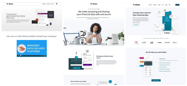
While there are fluctuations between our marketing content and product strategies, both share in the goal of enhancing the user’s experience. When I joined Akoya in 2019, Akoya.com was a bare-bones WordPress site. While it was simplistic in its design, at the time it was better than nothing and could be thought of as important as building the frame of a stairway without much form or function.
Our early customer prospects struggled to clearly understand our services and products; hence we interviewed them along with our own stakeholders to better understand where the ambiguity was most prominent. This provided us with the data we needed to iterate on the design and content in order to bring clarity to the Akoya value proposition. Our design and content team had produced well over two dozen iterations, and since then, the site has been updated a half dozen times with each successive delivery carrying customer-centered value which we synthesized from previous feedback mechanisms.
As analytical and creative professionals, we struggled with seeing each iterative release launch, seeking that balance between pace and perfection. Thankfully the changes have been well received by our diverse audience, and yet we still believe we can make it better. With each successive release we will continue to listen, question, analyze, and improve. Always.
Design to improve the customer experience with our products:
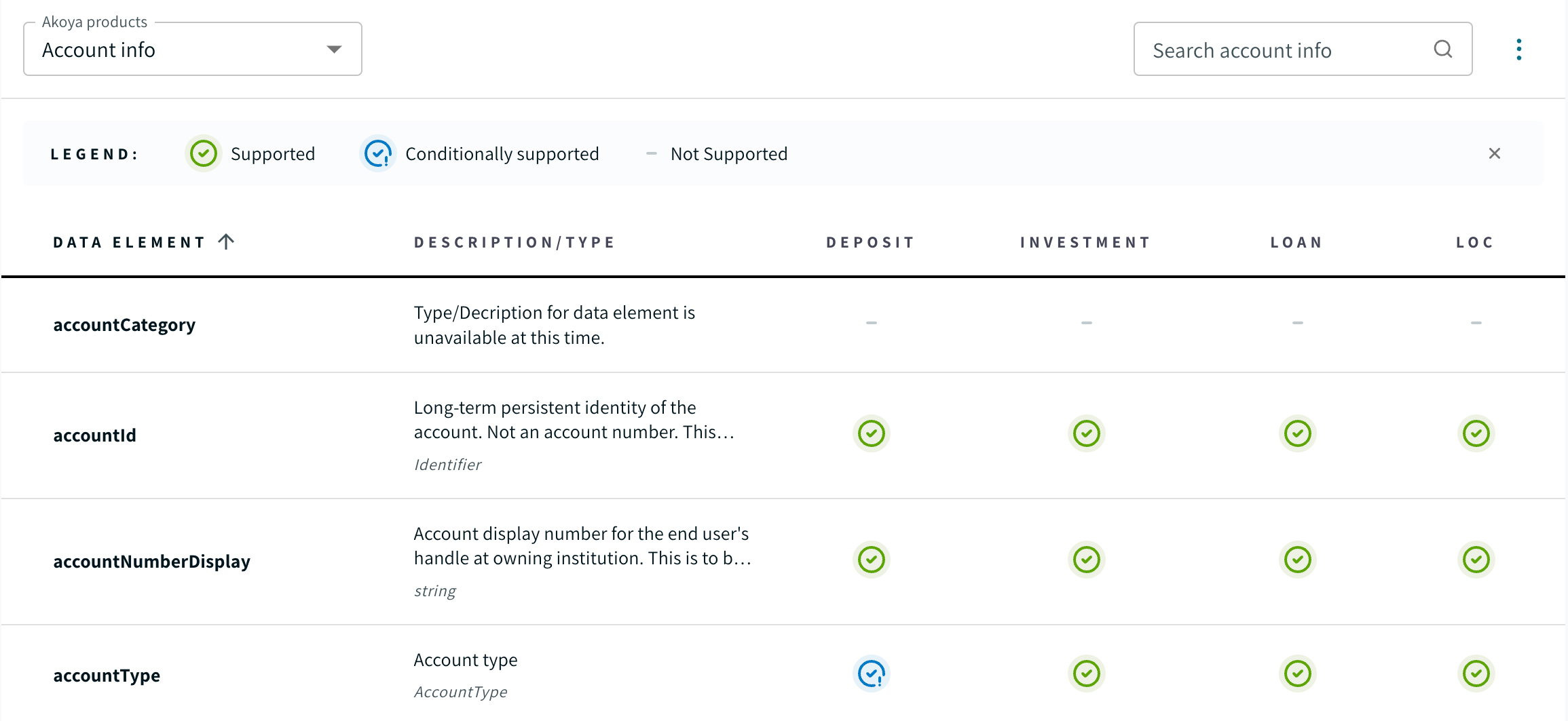
One important piece of information that our customers need to understand is which data elements are included in our API responses for the various account types within each of our products. Asking our users to digest this complex information places a great burden of responsibility on us to make it easier to comprehend.
We have designed and developed an effective table-like component to present this information to our users. This component has gone through at least a half dozen design iterations over the last year as we have learned from our customers and stakeholders what is working and what is not. During a design review, we recognized that representing a data element which is not provided from a bank was causing unnecessary cognitive load. We have a simple icon which conveys three various states, unsupported, supported, and conditionally supported. For people with vision impairments or other users viewing the screen from more than an arms-length away, it easily became a visual sea of circles repeating down and across the page, thereby making it difficult to scan and distinguish between the three states. We made a simple change to the unsupported state by removing the circle and just leaving a gray hyphen. This measure removed a great deal of noise and provided visual distinction while being easier to scan.
Simple but effective. It is these types of attention to details in the user experience that we seek to improve. As a result, we continually make design and content changes as our product evolves. While these small, iterative changes move our products in the right direction, they may or may not remain in the final designs.
We remain focused on delivering products that are functional, usable, and meet our customer’s needs, even if it means letting go of our original vision, but we never relinquish our passion for design and product excellence and will continue to push forward as our users deserve and demand. Our constant solicitation of user sentiments and collection of UX analytics provide us with the feedback and data we need to improve the usability of our products and services, which ultimately leads to higher NPS scores and adoption of our network. We flourish in a supportive and respectful culture of openness and collaboration where feedback from others is encouraged and considered a gift.
In today's fast-paced digital world, speed to market is mission critical, and users expect products to be iterated on and delivered quickly. By focusing on pace over perfection, we are able to create a perpetual cycle of product innovation and improvement where each release happens sooner and provides a better user experience. To embrace speed of delivery, we know that we need to remain agile and adaptable in our conceptions so that we are better positioned to pivot and change direction quickly.
Customer-centered continuous improvement, iterative design practices, and UX excellence are foundational pillars that support our pace over perfection philosophy at Akoya, which have resulted in profound positive impacts on the product to the benefit of our users.


